Delicious Typography

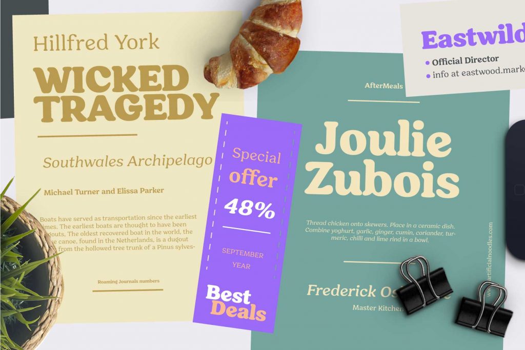
Hornbill, soft serif font family designed by Eko Bimantara in 2019
Food is one of the richest sensory experiences we have, yet our first encounter with it is nearly always visual. Before taste, before aroma, before texture, we see typography—on packaging, menus, storefronts, ads. Letters become flavors, shaping our expectations, sparking cravings, and guiding how we feel about a brand. In the world of food, typography doesn’t just communicate; it tempts.
Few examples illustrate this better than the iconic soft and curvy letterform of the Burger King logotype. Its rounded, bun-like letterforms echo the softness and warmth of the foods it represents. When the brand refreshed its identity in 2021, it embraced a custom typeface that celebrated the retro coziness of fast-food culture. The typography is plump, friendly, and deliciously nostalgic—so evocative that you can almost hear a grill crackling in the background.
Typography in food branding also thrives in the crowded battleground of supermarket shelves. Here, speed matters as much as style. Ben & Jerry’s leans into a chunky, handmade typographic voice—letters that look carved by a friendly giant. The wobble and weight of its forms echo the brand’s playful, rebellious spirit. It’s a typography that doesn’t whisper; it grins.
Restaurants and cafés extend these principles into spatial design. Chalkboard menus scrawled in vintage scripts evoke artisanal craftsmanship, perfect for bakeries selling slow-fermented sourdough. Fast-casual dining brands aim for immediacy. Shake Shack, for instance, pairs crisp sans-serif typography with friendly illustrated icons, striking a balance between elevated quality and everyday indulgence. Its type feels contemporary yet warm, mirroring the brand’s promise of “upscale comfort.”
Good design succeeds when the typeface embodies the flavor, mood, and story of the food it represents. A rustic bakery loses its soul in a sterile neo-grotesk. A creamy dessert brand would feel oddly stiff in an angular condensed sans. Typography, like seasoning, must match the dish.
Letters can feel creamy or crunchy, zesty or indulgent, playful or premium. They spark appetite long before the first bite. When chosen with care, typography becomes part of the culinary experience—an invisible flavor that enhances everything around it. Design, like cooking, is an act of craft. And when a brand selects the right typographic ingredients, the result is a visual feast that satisfies even before the taste arrives.
Font in use for this article: Slippery
Check our fonts which taste good:


