Do You See the Fonts When Reading?
You have already seen hundreds of letters today. Possibly thousands. There were letters on your phone before you got out of bed, on the toothpaste, on a cereal box, in a notification you ignored, in another notification you unfortunately couldn’t ignore. By the time you arrived at this sentence, your eyes had dealt with an impressive quantity of typography.
How many letterforms do you remember? Probably not many. This is slightly unfair to type designers. Someone can spend weeks adjusting the shoulder of an n, moving it a few units to the left, moving it back to the right, printing it, staring at it, distrusting it, going for coffee, returning, and moving it left again.
The reader looks at the finished n for a fraction of a second and thinks: nothing. They simply continue reading. Which raises a peculiar question.
When we read, do we actually see the font?
Your eyes are not doing what you think
Reading feels smooth. The eyes seem to move politely from left to right, collecting words in sequence like someone picking books from a shelf. They don’t.
Eye-tracking research has shown for decades that reading consists of a rapid alternation between fixations, when the eyes remain relatively still and acquire useful visual information, and saccades, extremely fast jumps between those positions. During normal reading, we also occasionally jump backward because something didn’t quite work the first time. Psychologists call these regressions. Readers call them, presumably, “wait, what?”
Keith Rayner’s influential review of decades of eye-movement research helped establish just how active and selective this process is. Reading is not a camera slowly photographing a line of text. The visual system samples information, moves, predicts, recognizes, occasionally retreats, and keeps constructing meaning. And it does all of this so efficiently that we experience none of the machinery. We experience a sentence.
That distinction matters to typography because letterforms occupy an unusual position between seeing and understanding. They must first exist as visual objects—black shapes, white spaces, curves, stems, counters—and somehow those shapes disappear into language.
Look at this word:
Reading
You can choose to inspect it as an object. There is the roundness of the e. The vertical stem of the d. The dot floating above the i. Depending on the typeface, the g may have one storey or two.
But the moment you actually read reading, most of that information seems to retreat. The word becomes an idea. Typography performs its trick by disappearing at precisely the moment it succeeds. Or at least, that is the romantic version of the story.
The science is more troublesome.
We don't exactly read “word shapes”
There is an old and extremely attractive idea in typography: experienced readers recognize whole words by their silhouettes. The ascenders rise. The descenders fall. Lowercase letters create distinctive contours. Eventually the reader supposedly learns these shapes and recognizes a familiar word almost as one recognizes a face.
Designers sometimes call these silhouettes Boumas. It is a beautiful theory. Unfortunately, reading research has spent a great deal of time making it less beautiful. Experimental evidence strongly supports the importance of individual letter information in word recognition. We do not simply photograph the outer contour of a word and look it up in a mental picture album. Letters and their positions matter enormously, although word shape, context, expectation and familiarity can contribute information too.
Experiments have produced wonderfully odd demonstrations of this. Change or remove parts of letters and people’s ability to identify words changes in systematic ways. Alter capitalization and some familiar visual cues disappear. Give readers a word they expect and the surrounding context can help them identify it surprisingly quickly.
Reading is therefore not quite “letters versus words.” The brain is less considerate than that. It uses whatever useful information is available. This is one reason debates about readability can become frustrating. Some says Serifs are more readable. Excellent. Problem solved. Except they aren’t universally more readable.
Carefully controlled research comparing letterforms with and without serifs has found little meaningful difference in ordinary reading speed. Aries Arditi and Jianna Cho, for example, manipulated serif size while controlling other properties and found no reading-speed advantage from serifs; a tiny advantage under some very small-print conditions appeared to be associated partly with the extra spacing introduced by the serifs rather than serifness itself.
A 2023 study involving 145 participants also produced an inconvenient result for simple rules: among the tested typefaces, one sans serif was read significantly faster than Arial, while the serif fonts were slightly faster overall. The researchers concluded that prescribing sans serif—and Arial specifically—for easy-to-read material was not justified.
So much for the convenient little battle between Team Serif and Team Sans. Typography, like nutrition, appears to attract rules faster than science can support them.
Readability is not inside the font
This may be the more useful way to think about it. We often talk about readability as though it were a substance contained inside a typeface. This font has lots of it. That one has less. But reading is an interaction. A beautifully drawn text face at six pixels is still six pixels. A perfectly legible alphabet can become unpleasant when its lines are too long, its spacing is cramped, or the contrast between text and background is miserable. A typeface comfortable in a novel may be an absurd choice for an airport departure board.
Size matters. Spacing matters. Letter differentiation matters. Line length matters. Medium matters. The reader matters. And familiarity matters in a particularly interesting way.
You are astonishingly experienced at reading. An adult reader has encountered certain letter structures over and over again for years. The exact typefaces vary, but the underlying conventions are remarkably stable. An a is allowed considerable freedom, but not infinite freedom. Push it far enough and at some point the reader stops saying “unusual a” and starts saying “what is that?”
Type designers work somewhere near this border. Move too little and nothing feels new. Move too far and someone has to stop reading. That stop is expensive. Not necessarily in money. In attention. The reader has suddenly noticed us.
Reading was not always like this
There is a temptation to imagine reading as a biological ability waiting patiently for humans to invent books. Then Gutenberg arrived and everything finally had something useful to do. But reading is culturally learned, and the way texts are constructed for readers has changed dramatically.
A modern English reader expects something almost embarrassingly luxurious: Spaces between words. We barely acknowledge them. They are literally nothing. Yet for long periods, Greek and Latin texts were commonly written in Scriptio Continua, with words running together without the systematic spacing familiar to us.
THISISNOTPARTICULA
RLYDIFFICULTFORAFE
WWORDS. AFTERAFEW
PARAGRAPHSYOUAND
IMAYHAVESOMEISSUES.
Readers had to perform work that modern typography performs for us. The history is complicated, and historians have challenged overly neat stories about ancient people always reading aloud and medieval people suddenly discovering silent reading. Silent reading certainly existed in antiquity. But the gradual spread of systematic word separation in medieval Europe did alter the visual organization of text in profound ways.
Historian Paul Saenger has argued that the introduction and eventual normalization of spaces between words helped facilitate rapid silent reading. What had once required the reader to identify boundaries within a continuous stream increasingly became visible on the page itself. Think about the strangeness of that. A blank area became reading technology. Nothing was invented. And reading changed. Today the space looks inevitable. It isn’t. It has simply had a very successful thousand years.
Readers learn typography too
This historical perspective complicates the phrase “naturally readable.” Natural to whom? A Roman reader trained on continuous text? A fifteenth-century scholar? A Victorian newspaper reader accustomed to dense columns of tiny type? Someone who has spent the last fifteen years reading mostly on a six-inch screen?
Typography adapts to readers, but readers also adapt to typography. The relationship goes both ways. This may explain part of our affection for familiar structures. We don’t arrive at a typeface as neutral visual-processing machines. We arrive carrying years of experience with alphabets, books, interfaces, signs, brands and conventions. Even the humble lowercase forms you are looking at now are historical objects. They just don’t feel historical. Neither does the space between these words. Successful conventions have a habit of disguising themselves as nature.
Nobody “reads” a restaurant menu
Well, perhaps someone does. Most of us hunt it. We look for categories. Then familiar words. Then prices. Then perhaps return rapidly to the prices after realizing we have accidentally become interested in the expensive section.
This is reading too. But it bears little resemblance to reading a novel. We scan airport signage. We skim news. We search a spreadsheet. We inspect a medicine label. We glance at a notification. We linger over a poem. We jump around a website. We read a contract with the deep commitment and concentration for which humanity is famous.
The physical act uses the same visual system, but the goal changes the behavior. This matters because there cannot be one universal ideal of readable typography when reading itself is not one universal activity.
An airport sign needs to surrender its information rapidly, often from a distance, sometimes to a tired person carrying three bags and running in the wrong direction. A novel can ask for sustained attention over hundreds of pages. A financial dashboard must allow comparison. A poster may have three seconds. A luxury advertisement may deliberately slow recognition because looking is part of the experience. A children’s book can allow letters to participate in play. A warning label would probably prefer not to be mysterious.
Typography is not merely formatting language. It negotiates the conditions under which language will be encountered.
Then why can fonts have personality?
Here things become even stranger. Readers may not consciously inspect the typeface, but this does not necessarily mean typography has no effect beyond legibility.
We are remarkably good at attaching associations to visual forms. A typeface can look bureaucratic. Another can look expensive. Something can feel technical, friendly, literary, institutional, nostalgic, cheap, authoritative, childish or suspiciously like a wedding invitation.
These associations are not universal laws hidden in the curves. They are mixtures of visual characteristics, cultural exposure and context. Blackletter does not contain “medieval” molecules.
We learned the association. Likewise, a geometric sans does not contain technology. Put it on enough technology companies, however, and culture begins doing some of the work.
Research into typographic associations supports the broader idea that people consistently connect type styles with semantic and affective qualities, although these relationships are contextual rather than a reliable dictionary in which one shape always equals one emotion.
Designers have a strange occupational problem
Once you learn typography, it becomes harder not to see it. You notice the a. You notice that the e is too closed. You notice the spacing around the capital T. You notice that somebody used fake italics. You notice a stretched font on a restaurant sign and briefly lose your appetite.
This is not necessarily how everyone else sees the world. A reader can respond perfectly well to typography without possessing the vocabulary to describe it. Someone does not need to know what an aperture is to struggle with letters whose apertures are too closed under difficult viewing conditions.
Nor does someone need to identify a typeface to feel that a document looks formal. This is normal perception. We constantly respond to things we cannot name. You can recognize an old friend’s walk from fifty metres away without being able to produce a technical analysis of their knees. Typography works somewhere in that territory. The designer sees decisions. The reader experiences consequences.
We notice fonts when they fail
Perhaps the original question has the wrong emphasis. Maybe we should ask: When do we see the font?
The answer is often: when something interrupts reading. A letter looks like another letter. Spacing produces an unfortunate word. Text is too small. Contrast disappears. A line is painfully long. A decorative form makes us hesitate. Something expected to look serious suddenly looks like a birthday invitation.
The typography comes forward. But failure is not the only reason. Sometimes it is invited forward deliberately. Look at a magazine cover where the headline dominates the image. A movie title. A protest poster. A fashion campaign. Experimental editorial design. Lettering on an album cover.
Here we are supposed to oscillate between reading and looking. The words are language and image at the same time. This is why the old maxim that “good typography is invisible” is useful only until it isn’t.
For continuous reading, invisibility can be a wonderful achievement. Nobody wants chapter twelve of a novel to suddenly demand admiration for its terminals. But typography has other jobs. Sometimes the interruption is the message.
Look at the letters again
There is a small irony in everything you’ve just read. For several minutes, this article has been asking you to think about letterforms. Yet you have probably ignored almost every one of them.
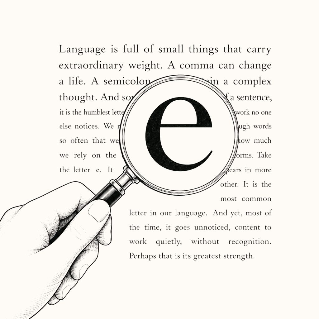
There have been hundreds of lowercase e. Did you inspect them? Probably not. They did their job and left. There were spaces too—hundreds of tiny pieces of nothing separating the words, descendants of a typographic convention that once wasn’t obvious at all.
You used every one of them. You may not have seen any. And perhaps this is what makes typography such a strange design discipline. Its raw material is visible, but much of its success occurs after conscious vision has moved elsewhere.
A type designer draws shapes. A reader comes looking for meaning. For a fraction of a second, somewhere between the eye and the mind, the two meet.
Then the reader moves on.