How Grotesk Changed the World
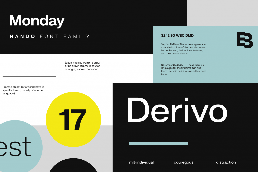
Hando, neo grotesk font family designed by Eko Bimantara in 2020
In the long arc of design history, few typographic genres have shaped the modern world as profoundly as the grotesk. Born in the industrial haze of the nineteenth century, the early grotesks arrived with a quiet, utilitarian ambition: to communicate clearly in a rapidly modernizing society. They stood in stark contrast to the ornate serif traditions that preceded them—clean, blunt, and unapologetically functional. At first, critics found them strange, even inelegant, hence the name “grotesk.” Yet within this perceived awkwardness lived a new visual order, one that would soon redefine how entire cities, industries, and cultures communicated.
Early representation of the neo-grotesk typefaces is Akzidenz-Grotesk, crafted by the Berthold Type Foundry in 1898. Unlike the decorative styles that crowded posters and publications of its time, Akzidenz carried a quiet confidence. Its forms were plain but precise, stripped of artistic flourish and shaped instead by the functional needs of commerce and industry. Printers loved it for its clarity. Designers admired its restraint. And in an age of expanding cities, busy rail networks, and increasingly complex public life, Akzidenz offered something revolutionary: a typeface that could speak to everyone, effortlessly.
As the twentieth century gained momentum, this ethos of clarity grew into a movement. Modernists embraced the neo-grotesk as a perfect reflection of their ideals—minimal, systematic, rational. Out of this spirit, Helvetica was born in 1957, a refinement of the grotesk tradition that would become one of the most influential typefaces in history. Helvetica didn’t ask for attention. It offered neutrality, balance, and a sense of global clarity that felt almost utopian. Government agencies adopted it. Corporations adopted it. And in time, entire nations used it to guide millions of people through airports, metros, and public spaces.
This is where the grotesk found one of its greatest callings: wayfinding. In the bustling heart of major cities, where clarity must triumph over chaos, it became the invisible backbone of navigation. Its letterforms—neither too narrow nor too wide, neither too ornate nor too plain—were perfectly suited for quick reading at various distances. Cities like New York, Tokyo, and Berlin adopted neo-grotesk-based systems for signage, ensuring commuters could find their way through dense, ever-moving crowds. High-contrast serifs might charm on a magazine cover, but in a subway tunnel at 40 km/h, they falter. Grotesks endure.
Yet the impact of grotesks doesn’t end at public infrastructure. In technology’s rise, they became the natural choice for digital interfaces. Their even proportions and simple geometry translate beautifully to pixels, making them the standard for operating systems, apps, and device interfaces. The same qualities that once guided people through train stations now help them navigate smartphones and laptops.
What makes grotesks remarkable is their balance: sturdy enough for industrial signage, refined enough for corporate branding, neutral enough for interfaces, and adaptable enough for contemporary reinvention. Today’s designers reinterpret these forms with subtle quirks—playing with terminals, adjusting proportions, adding warmth—yet the backbone of the grotesk remains as steadfast as ever.
Grotesk typefaces changed the world by making it legible. They shaped how cities communicate, how people move, how information is shared, and how technology speaks to us. Their presence is so deeply woven into daily life that we often forget to see them at all. But that is their power: they communicate without demanding attention, guiding us with a clarity that feels both timeless and inevitable. In their simplicity, grotesks transformed the visual language of the modern world. And in their neutrality, they provided something rarer still—typography that feels universal, enduring, and profoundly human.
Font in use for this article: Binoma
Check our neo-grotesk fonts:


