Choosing the Right Typeface for Brand Identity
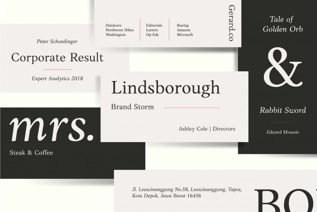
Anko, serif font family designed by Eko Bimantara in 2019
Choosing the right typeface for a brand is less a technical decision than an act of storytelling. Typography shapes a brand’s voice long before a word is spoken aloud. It determines whether a company feels confident or cautious, warm or distant, timeless or experimental. Yet many brands still treat type as surface decoration, selecting fonts the way one might pick wallpaper—pleasant, but ultimately replaceable. In truth, type defines a brand’s character as surely as its colors, logo, and tone of voice.
Every thoughtful typographic choice begins with an understanding of personality. Before browsing font libraries or sketching ideas, a designer must listen closely to the brand’s voice. Is it spoken with a gentle friendliness or with crisp professionalism? Does it lean toward the refined heritage of classic forms, or does it push forward with the sharp, efficient shapes of modern geometry? A luxury skincare label might whisper through elegant, high-contrast serifs, while a young tech company may speak more clearly through clean, futuristic sans-serifs. Even a children’s brand, with its soft and rounded letterforms, reveals its world through type. The chosen voice must never feel like a costume—only an honest extension of who the brand is.
Once that voice is understood, the designer must imagine where it will be heard. Typography lives not on a single poster or website banner but across dozens of touchpoints: the hero message on a homepage, the small text inside a mobile app, the bold letters glowing on a billboard at dusk, the labels on packaging carried from store to home. A typeface dazzling in a headline may falter when reduced to eight pixels on a phone. A font designed for long-form reading may feel too subdued to carry a brand’s most expressive moments. The strongest identities are built on type families with enough flexibility to speak consistently in every setting.
Of course, beauty without function is a weak foundation. Functional considerations must always accompany aesthetic ones. Typography that reads effortlessly at small sizes, prints cleanly, and adapts gracefully across media will serve a brand faithfully for years. Corporate teams, especially, depend on typefaces that are not just visually appealing, but reliable workhorses.
A brand does not exist alone in the world; it speaks into a crowded room. Understanding the visual language of its competitors can help it both fit in and stand apart. When fintechs flock to geometric sans-serifs, a humanist sans may bring warmth. When fashion houses drift toward the drama of high-contrast serifs, a modern serif with subtle quirks might feel more distinct. The key is to find the delicate space between uniqueness and credibility—too familiar, and it fades; too unusual, and it risks confusing the audience.
Because brands evolve, a type family must be chosen with growth in mind. As a company expands into new markets or embraces new platforms, its typography must expand with it to ensure the identity remains consistent even as the brand stretches into new territories. This future-readiness also includes licensing—a practical but often overlooked aspect. Understanding how and where the typeface will be used, by whom, and at what scale prevents legal or financial complications down the line.
Typeface should never be chosen only in theory. It must be tested, lived with, and observed in real brand scenarios. When placed inside a homepage hero, an app interface, or a packaging mockup, the type reveals its true nature: its rhythm, its tone, its balance with imagery and color. Only in these lived environments can designers judge whether it truly carries the brand’s story.
In the end, choosing a typeface for a brand identity is a subtle blend of intuition and analysis, art and structure. The right typeface amplifies the brand’s voice, sharpens its message, and creates a lasting sense of presence across platforms and years. Agencies and designers who treat typography not as an afterthought, but as a central pillar of identity, build brands that feel stronger, clearer, and far more memorable.
Font in use for this article: Daisler
Check our fonts which ussually used for brands:


