
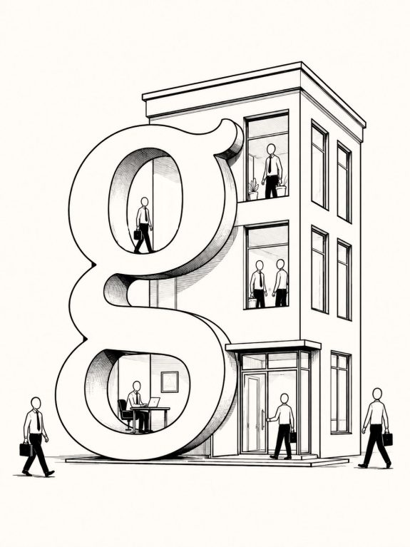
How Typography Scales Businesses
There is a funny moment in the life of a growing company when somebody realizes that nobody knows which font to use anymore.
In the beginning, this is rarely a problem. There is a logo. A website. Maybe some packaging. Someone on the team—often the person who knows Illustrator slightly better than everyone else—has chosen a typeface. The headline is 42 pixels because it looked good at 42 pixels. The Instagram posts look vaguely related to the website. The pitch deck has its own interpretation of the brand. Everything works.
Then the company grows.
Suddenly there are six designers, an external agency, a mobile app, twelve kinds of packaging, a sales team making presentations at midnight, a developer asking whether Medium means 500 or 600, and somebody in another country who has discovered that the company font doesn’t contain the characters needed to write the name of their city.
Typography has quietly stopped being a font choice. It has become infrastructure.
Nobody notices a type system when it works
This is perhaps typography’s least glamorous achievement. A good typographic system can make thousands of decisions disappear.
A designer doesn’t have to decide from scratch what a product title should look like. A developer doesn’t need to approximate the hierarchy from a Figma screenshot. The marketing department doesn’t invent a new collection of font sizes every time there is a campaign.
The decisions have already been made. This sounds boring. It is also extremely useful.
Consider how much written material even a moderately sized company produces. There are product pages, invoices, advertisements, packaging, emails, presentations, interfaces, instruction manuals, social posts, internal documents, signage and things nobody remembered when the brand guidelines were written. Every one of them contains typography.
At this point, consistency is no longer about making everything look identical. It is about creating enough rules that hundreds of different things can still feel related. That is a very different design problem.
A font has to survive real life
Designers have a slightly unfair advantage when presenting typography. We get to choose the words.
We choose a beautiful photograph, write something short like Future Objects, make it 96 points, add generous whitespace, and suddenly almost any decent typeface can look magnificent.
Businesses do not live in type specimens. They live in places like:
“Your payment could not be processed. Please update your billing information.”
Less romantic. Much more important.
A typeface used by a growing company has to survive product names, legal disclaimers, tiny buttons, long German compound words, currencies, spreadsheets, packaging ingredients, mobile screens and presentations assembled by people who have absolutely no interest in typography.
That last test may be the hardest one.
The question therefore changes from Does this typeface look good? to How many situations can this typography handle before somebody has to improvise?
That is where families, weights, widths, character sets and variable fonts start becoming more than features on a font product page.
They provide room. A condensed width can rescue a narrow interface. A broader family can establish hierarchy without introducing another typeface. Variable fonts can allow responsive systems to adjust typography continuously rather than jumping between a handful of fixed styles. A well-developed character set can prevent an international expansion from becoming an emergency font hunt.
None of these things is particularly dramatic. Scale rarely is. Scale is usually a thousand small problems arriving at the same address.
Recognition happens before reading
There is another reason typography becomes more valuable as businesses grow: repetition.
People encounter brands over and over again, often for only a few seconds.
They see a package across a supermarket aisle. A notification. A billboard from a moving car. An app icon followed by a screen. A receipt. A sponsored post they would rather not admit they noticed.
Over time, typography becomes part of this accumulated memory.
Think about how strongly typography participates in the identities of companies such as IBM, Netflix, Spotify, Airbnb or The New York Times. Remove the logo from certain communications and there can still be something recognizable in the proportions, weight, spacing and manner in which language occupies the page.
That recognition is difficult to measure in isolation because typography does not work alone. Color, photography, motion, language and product experience all contribute to it. This is worth saying because design writing occasionally gives typography suprising powers.
Changing a font will not fix a bad product. Kerning has never repaired customer service. And there is, unfortunately, no OpenType feature for increasing quarterly revenue.
But visual recognition is built through repeated signals, and typography is one of the signals businesses use most often simply because businesses use words everywhere. The larger the organization becomes, the more often those signals are repeated.
Then someone opens PowerPoint
Brand systems look wonderful during launch presentations.
Real life begins afterward.
A company can spend months developing an elegant identity, only to discover six months later that the Singapore office is using Arial because the official fonts were never installed, the sales department has stretched the logo to fit a slide, and one agency has somehow been using the wrong weight since February.
This isn’t necessarily bad design. It is often a systems problem.
If maintaining a brand requires everyone to possess unusually good typographic judgment, the system will eventually fail. Scale introduces people with different jobs, skills, software and priorities.
A useful typography system anticipates this. It defines relationships rather than individual compositions: headline to body, large to small, loud to quiet, editorial to functional. It establishes enough constraints to create coherence but leaves enough flexibility for people to actually do their jobs. The distinction matters. A poster is designed. A system is used.
There is an economics to all this
Companies rarely calculate the return on typography as neatly as they calculate advertising spend. There is no convenient dashboard saying:
Better kerning: +3.7% revenue.
And anyone claiming such precision deserves some suspicion. The economics are more indirect.
A coherent type system can reduce duplicated design decisions. A suitable family can eliminate the need to constantly substitute fonts. Appropriate licensing can allow the same typography to move legally across teams and media. A custom typeface can sometimes simplify large-scale deployment or strengthen differentiation, although it can also introduce substantial development and maintenance costs.
For a tiny company, none of this may matter very much. Buying a good retail font and getting on with the work may be the smartest decision.
At another scale, however, the calculation changes. When hundreds or thousands of people repeatedly create communication, tiny inefficiencies multiply. So do inconsistencies.
The value of typography begins to move away from the price of the font itself and toward the number of decisions the system can reliably handle. That is an important distinction.
A $50 font can be expensive if it constantly creates problems. A much larger typography investment can be inexpensive if it solves the same problem a million times. Context decides.
Scale changes the question
Perhaps this is why typography feels different inside mature brands. It is still visual. It can still be expressive, strange, elegant, loud, fashionable or deliberately plain.
But underneath the visible layer is something more mechanical. Typography distributes decisions. Someone decides how information should behave once, and hundreds of people can reuse that decision later.
That is surprisingly close to what businesses themselves do as they scale. A tiny restaurant can depend on the owner remembering how everything should be done. A restaurant chain cannot. A small company can have its designer personally inspect every advertisement. A global organization cannot.
Growth requires turning judgment into systems without removing judgment altogether. Typography has to do the same thing. So perhaps the first typography question for a new business really can be the simple one:
Which font looks right?
There is nothing wrong with that. But if the business is fortunate enough to grow, another question eventually arrives.
The website becomes a product. One market becomes twelve. Five employees become five hundred. A handful of advertisements becomes thousands of pieces of communication moving through the world every day.
And then the question is no longer only whether the typography looks right.
It is whether it can make the journey.